【HTML&CSS】display:flex;で横並びにしたものを縦に並べたい
「display:flex」プロパティは要素を横に並べる時に使います。
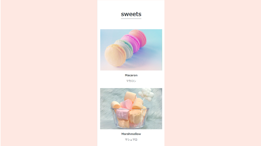
display:flexで横に並べた要素をレスポンシブで縦に並べたい時はどうしたら良いでしょう。
display:flex;で横に並べたものを縦にならべるとき
display:flex;でわざわざ横並びにしたものを縦並びにしたいときはレスポンシブで画面サイズを変更するときです。
画像などが画面からはみ出したり、スマートフォンでも見やすいレイアウトにするため要素を縦に並べます。
display:flex;で横並びにしたものを縦に並べるときはflex-direction: column;を使う
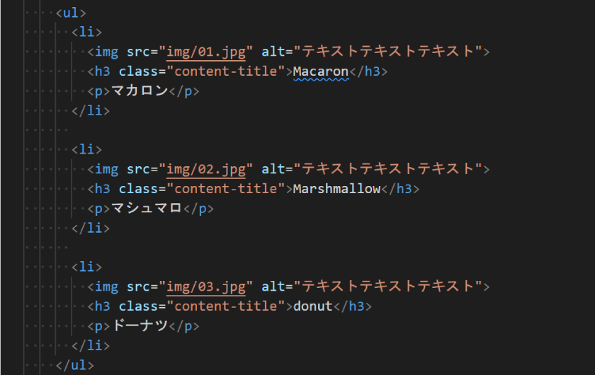
リストは縦にならぶ
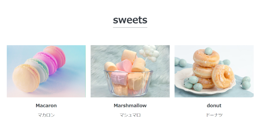
リストで画像とテキストをを並べました。
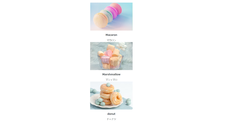
cssを適用しないとこのように縦に並びます。
  <section id="sweets" class="wrapper">
    <h2 class="section-title">sweets</h2>
    <ul>
      <li>
        <img src="img/01.jpg" alt="テキストテキストテキスト">
        <h3 class="content-title">Macaron</h3>
        <p>マカロン</p>
      </li>

      <li>
        <img src="img/02.jpg" alt="テキストテキストテキスト">
        <h3 class="content-title">Marshmallow</h3>
        <p>マシュマロ</p>
      </li>

      <li>
        <img src="img/03.jpg" alt="テキストテキストテキスト">
        <h3 class="content-title">donut</h3>
        <p>ドーナツ</p>
      </li>
    </ul>
   </section>
display:flex;で横並びにさせる
要素を横並びにするdisplay:flex;は親要素に指定します。
今回子要素の<li>を横並びにしたいので、その親要素の<ul>に「display:flex;」を適用します。
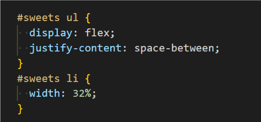
横並びにすることができました。
display: flex;では子要素を横に並べます。
justify-content: space-between;では要素と要素の間に余白を設けます。
#sweets ul {
  display: flex;
  justify-content: space-between;
}
#sweets li {
  width: 32%;
}
スマートフォンでは縦に並べる
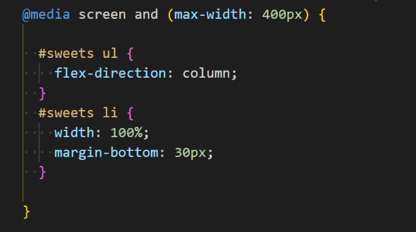
@media screen and (max-width: 400px) {

  #sweets ul {
    flex-direction: column;
  }
  #sweets li {
    width: 100%;
    margin-bottom: 30px;
  }

}
画面サイズが小さいスマートフォンではflex-direction: column;で縦に並ぶようにします。
**********
<未経験でも安心完全無料のプログラミングスクール>
flex-directionプロパティはflexの配置方向を指定するプロパティ
flex-directionプロパティはflexの配置方向を指定するプロパティです。
display:flex;を指定した上で追加で記述します。
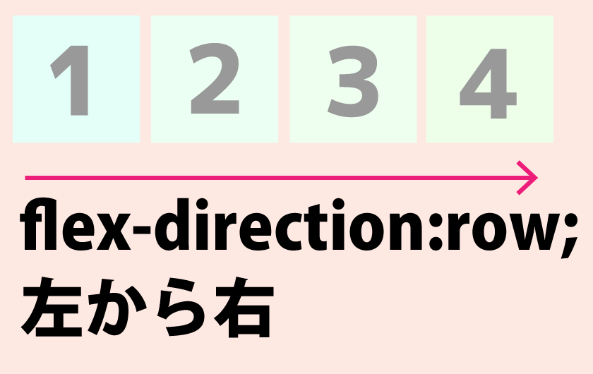
flex-direction: row;では要素は左から右に並びます。
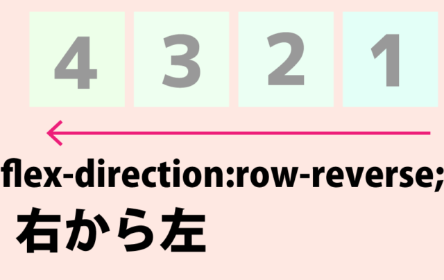
flex-direction: row-reverse;では要素は右から左に並びます。
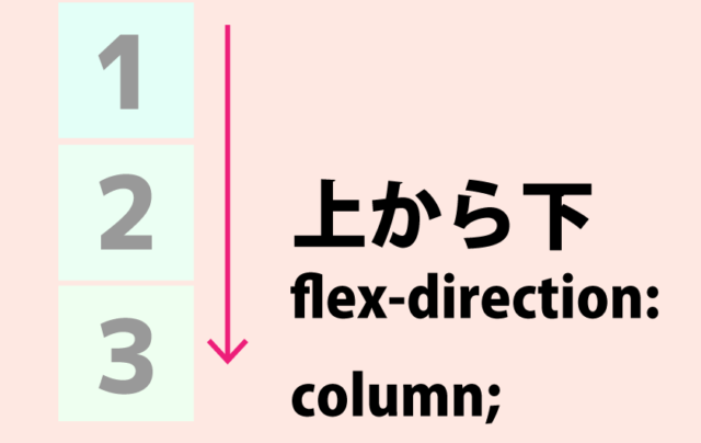
flex-direction: column;では要素は上から下に並びます。
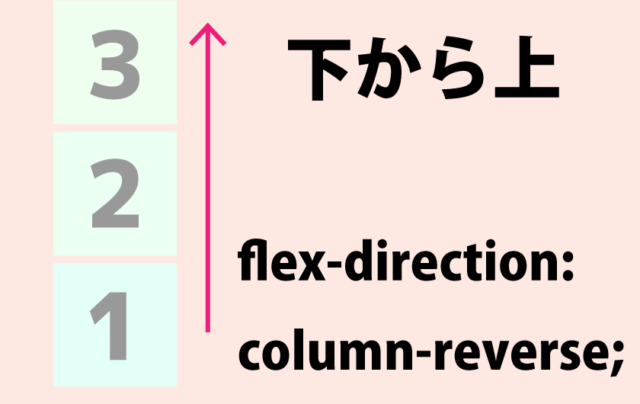
flex-direction: column-reverse;では要素は下から上に並びます。
まとめ
<未経験でも安心完全無料のプログラミングスクール>
 https://www.beginavi.net/graphic-designer/
