【HTML&CSS】ギャラリーサイトを作る(グリッドレイアウト)

ギャラリーのようなサイトを作りたいです。
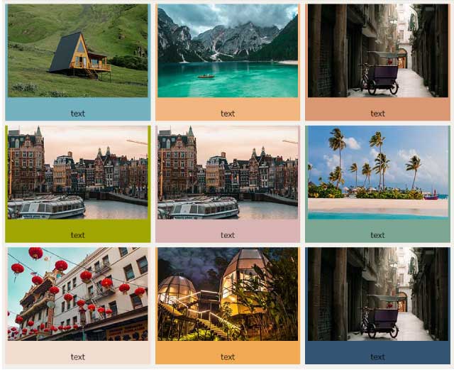

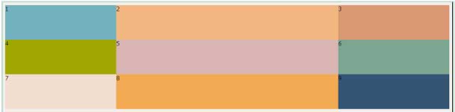
今回はこのようなレイアウトができるグリッドレイアウトについてみていきましょう。

 https://www.beginavi.net/htmlcss-flexbox/
gridレイアウト
gridレイアウトは列と行で格子状に要素を並べていくレイアウトです。
デザインがしやすくギャラリーサイトのようなサイトに利用されます。
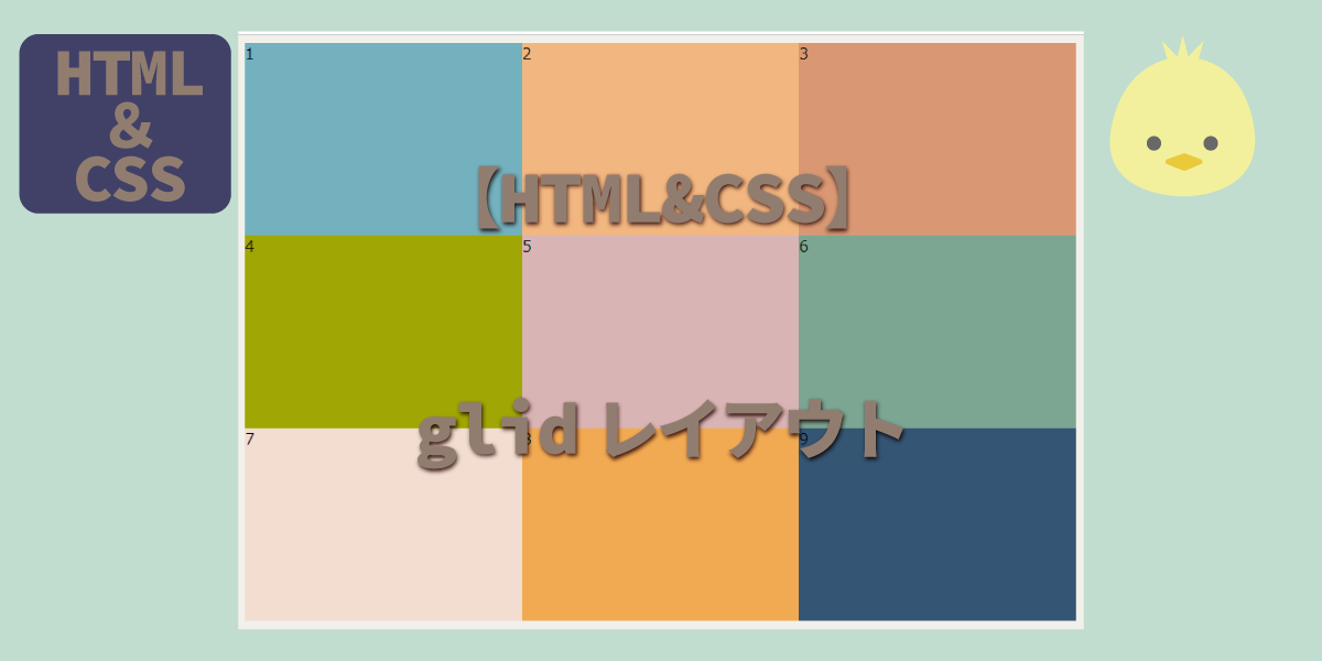
グリッドレイアウト(基本)
【HTML】
タイル状に並べたい要素を親要素(containerというクラス名を付けました)で囲みます。
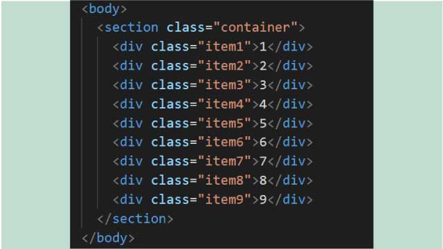
<body>
  <section class="container">
    <div class="item1">1</div>
    <div class="item2">2</div>
    <div class="item3">3</div>
    <div class="item4">4</div>
    <div class="item5">5</div>
    <div class="item6">6</div>
    <div class="item7">7</div>
    <div class="item8">8</div>
    <div class="item9">9</div>
  </section>
</body>
【CSS】
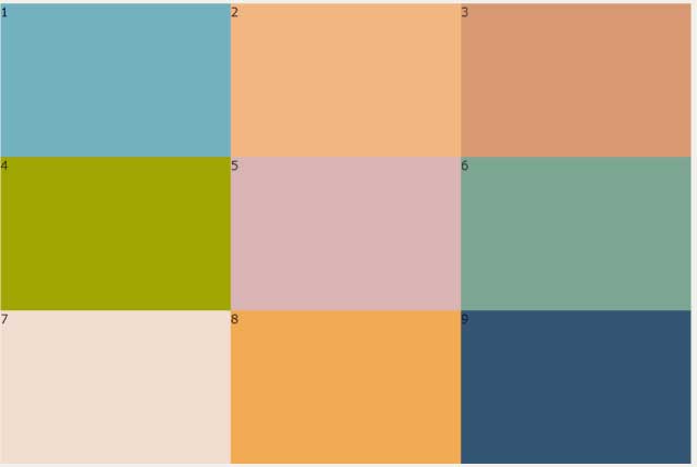
親要素に『display:grid;』をかけます。
『grid-template-columns』で必要なグリッドアイテムの数だけ幅を指定します。
今回は『300px 300px 300px』と3列です。
次に『grid-template-rows』で高さの指定をします。
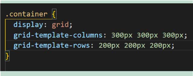
.container {
  display: grid;
  grid-template-columns: 300px 300px 300px;
  grid-template-rows: 200px 200px 200px;
}
するとこんな感じ。
分かりやすいように『background-color』を付けています。
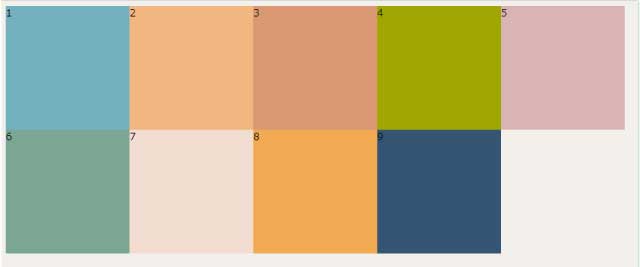
幅指定を増やす
幅の指定を5個してみます
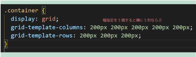
.container {
  display: grid;
  grid-template-columns: 200px 200px 200px 200px 200px;
  grid-template-rows: 200px 200px 200px;
}
すると5列になります
要素の間に余白をつける
列と列行と行の余白は『gap』で指定します。
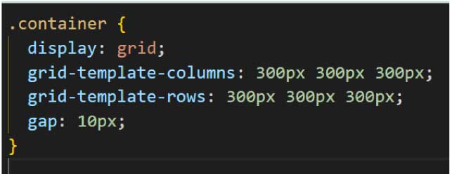
.container {
  display: grid;
  grid-template-columns: 300px 300px 300px;
  grid-template-rows: 300px 300px 300px;
  gap: 10px;
}
10px付けてみました。
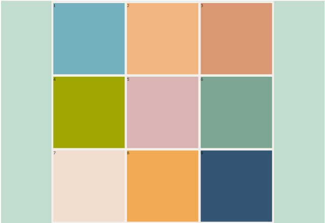
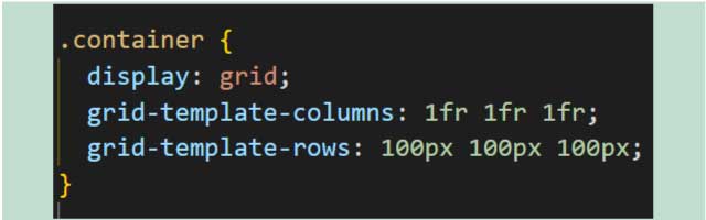
比率で指定
今までpxで指定していましたが、『1fr 1fr 1fr』とすると比率で指定する事ができます。
.container {
  display: grid;
  grid-template-columns: 1fr 1fr 1fr;
  grid-template-rows: 100px 100px 100px;
}
1:1:1の比率になる。
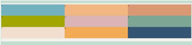
『1fr 2fr 1fr』にすると『1:2:1』つまり『25%:50%:25%』になります。
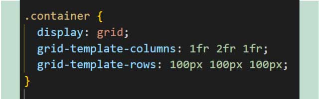
.container {
  display: grid;
  grid-template-columns: 1fr 2fr 1fr;
  grid-template-rows: 100px 100px 100px;
}
応用
『grid-template-areas』を使うともっと自由な表現ができます。
親要素に『grid-template-areas:』
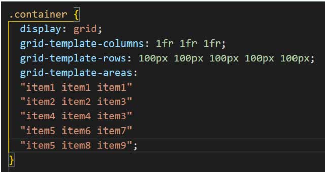
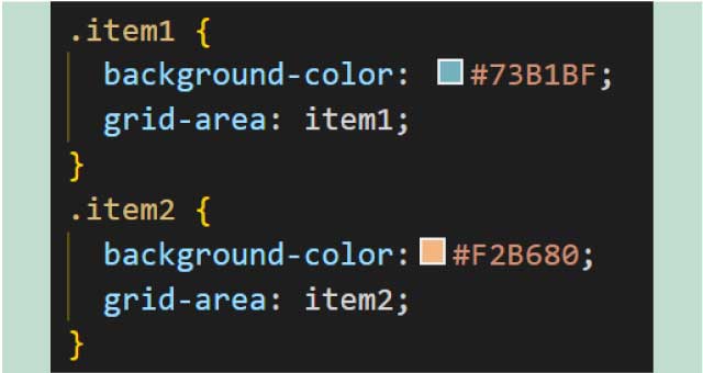
それぞれの子要素全てに対応する名前を『grid-area:』で付けます。
『grid-area:item1;』のようにします。
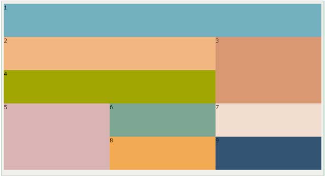
並べるとこのように要素を並べることができます。
するとこのように自由な並べ方ができます。
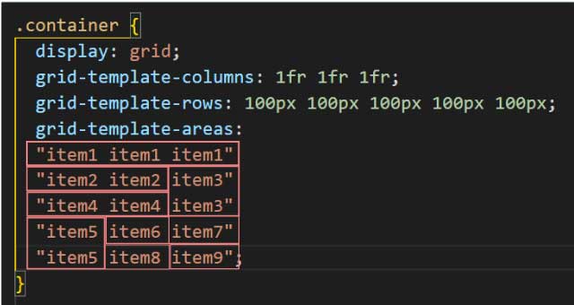
.container {
  display: grid;
  grid-template-columns: 1fr 1fr 1fr ;/*列の数だけ必要*/
  grid-template-rows: 100px 100px 100px 100px 100px;/*行の数だけ必要*/
  grid-template-areas:
 "item1 item1 item1"
 "item2 item2 item3"
 "item4 item4 item3"
 "item5 item6 item7"
 "item5 item8 item9";
}
このように簡単にタイル状のレイアウトをすることができます。

**********
displayblockやgridについて初心者にもわかりやすく説明してくれている本です。
基本的なことがこの1冊にすべて詰まっていてとてもおすすめの1冊です。
**********
ギャラリーに動きをつけたいならこちらの「動くWebデザインアイデア帳」がおすすめです。
動きのあるパーツはこの1冊でほとんどできます!
同じカテゴリの記事一覧へ